How to import the Template
Once you’ve downloaded the template, open Unity and navigate to Assets > Import Package > Custom Package. Select the Unity asset file that you downloaded, and be sure to import all packages.
How to Use the Template
The template files will be available in the ‘UI Template’ folder within the Qookie Games folder inside the Plugin Folder. You can access the main scene that contains all the UI elements (canvas) in the ‘UIScenes’ folder, specifically in the ‘UIScene’ scene.
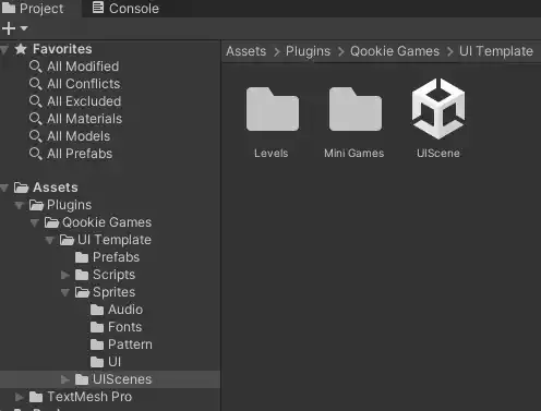
You can keep it here or move the ‘UIScene’ scene to your main Scenes folder.
In this scene, you’ll find an AudioManager GameObject and a Canvas that contains all the UI elements of this template. The AudioManager is used to play Sound FX and Music in the game; it’s created similarly to the one demonstrated in this Brackeys tutorial.
Customize The UI Template
To customize the UI, click on the canvas, and scroll down to the UIManager Script. Here, you can find almost all customization settings.
Game Properties
Depending on your game, you can choose whether it is a level-type game by checking the ‘HasLevels’ toggle. Similarly, if your game includes mini-games, check the ‘HasMiniGames’ toggle. You can later customize the number of levels and mini-games in the respective sections. If you disable both options, it indicates that your game has only one main game, which you can later assign to load in the ‘Buttons’ section.
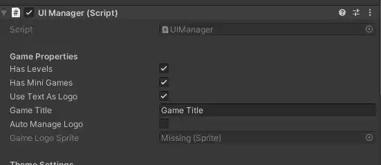
You can decide whether you want the game title to appear as text or a logo, and then choose your game title. However, please note that the size and placement of the game title are not customizable since they adjust dynamically based on the screen size and orientation (portrait or landscape). If you prefer not to use this option, you can uncheck ‘useTextAsLogo’ and ‘autoManageLogo.’
Theme Settings
In the Theme Settings, you can customize the color for the entire UI. You can disable this feature by toggling off ‘AutoManagerColors.’ The accent color corresponds to the color of buttons. The panel color represents the background color of panels and popup panels, while the Text color dictates the color of all texts and some logos in the buttons. The ‘PopupBackground Color’ refers to the color of the background when a popup appears; it’s advisable to choose a transparent color for this setting.
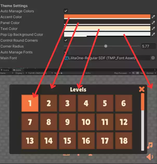
You can adjust the round corners radius of the popup panels. Setting it to 10 (Max) will display it as square, while lowering it will result in smoother corners.
You can also set the main font for all texts, utilizing TextMeshPro Font Assets.
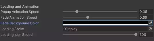
Loading and Animation
When you load a scene, a fade-in/out animation occurs with a loading icon in the middle. You can customize the fading background color, the fading time, the loading icon’s sprite, and the loading icon rotation speed. To make it spin the other way around, you can set the rotation speed to a negative value. The color of the loading icon is determined by the accent color. Additionally, you can choose the popup animation speed using the ‘popupAnimationSpeed’ slider.
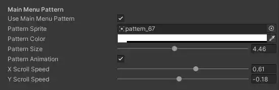
MainMenu pattern
You can activate a pattern for the main menu and customize the sprite, color, size, and even enable animation. Choose from a variety of patterns provided in this project, courtesy of Kenny. Additionally, you have the option to select the animation speed and direction.
Buttons
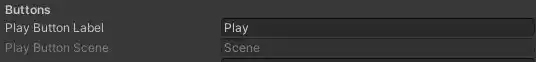
You can modify the label of the Play button here. If you’ve enabled the ‘HasLevels’ toggle, clicking the Play button will open the Levels Popup Menu. If the toggle is unchecked, it means you have a main game, and you can choose to load its scene by entering the name of the scene to load when the button is pressed.
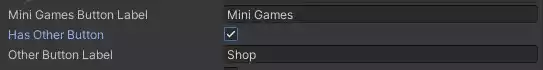
You can customize the label of the Mini Games button. This button opens the mini-games panel if there are more than one mini-game or opens it directly if there’s only one. Additionally, you can add an extra button, the “Other Button,” and modify its name. This button can serve various purposes; to customize its function, simply add the desired functionality in the onClick event of the button.
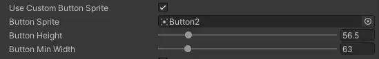
You can incorporate a custom sprite for all buttons. This will adopt the exact ratio of the sprite and apply it to all button images. To adjust the size, you can customize it by modifying the Button Height and Button Min Width sliders.
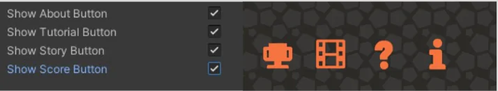
You can decide which mini buttons you want to display by toggling these switches. Customize the function of each button by accessing the onClick event associated with the button.
Levels
The Levels Panel title is the label that appears above the Level Panel Popup. You can determine the number of levels in your game by inputting the desired number.
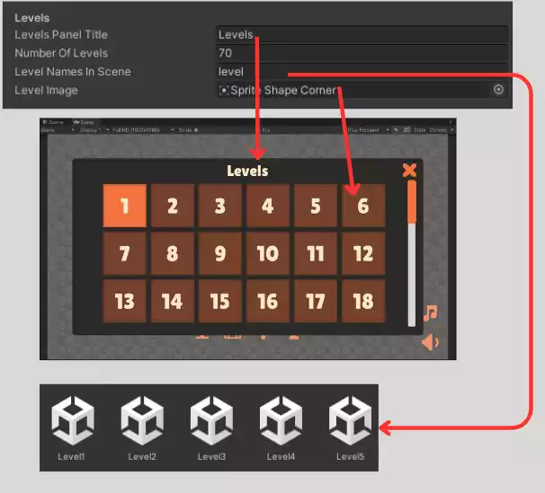
The Level Image is for the image associated with each Level button.
The Level Names In Scene are used to indicate the scene name for each level. For instance, if you input “level,” it implies that your level scenes are named like level1, level2, level3. Leaving it empty suggests that your level scenes are named as 1, 2, 3.
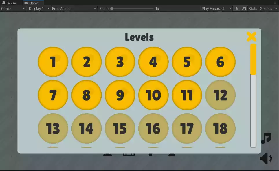
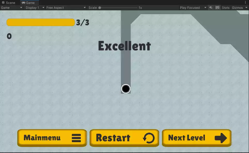
The level buttons unlock upon completing each level. To mark a level as complete, call the function UIManager.Instance.completeLevel(true);. This action triggers the current level as completed, showcasing a customizable Win Message (editable in the Game Over Titles). Three buttons (Main Menu, Restart, and Next Level) will appear for player interaction.
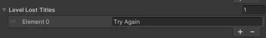
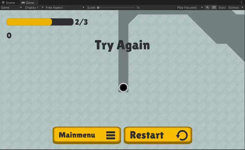
Calling the function UIManager.Instance.completeLevel(false); signifies that you’ve lost a level. The UI will showcase a customizable Lose Message (editable in the Level Lost Titles) and display two buttons: the Main Menu button and the Restart button.
Call UIManager.Instance.gameOver() if you aren’t using levels and the mini-game or the main game is completed.
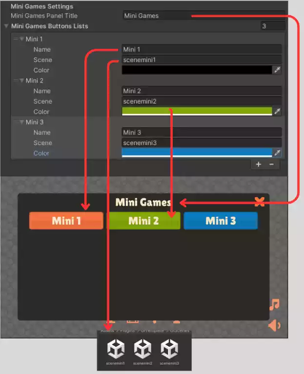
Mini Games Settings
The Mini Games Panel title alters the label at the top of the Mini Game panel. You can add as many Mini Games as you want, customizing the label name, the scene where the mini game is located, and the color of the mini game button (set it to transparent to adopt the accent color).
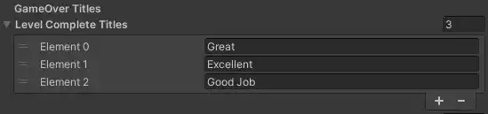
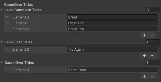
GameOver Titles
You can customize the Level Complete Titles, the Level Lost Titles, and Game Over Titles. The Level Complete titles appear after calling UIManager.Instance.completeLevel(true). The Level Lost title appears after calling UIManager.Instance.completeLevel(false).
And the Game Over Titles appear after calling UIManager.Instance.gameOver(). This one is used for main games and Mini Games.
Extra Functions
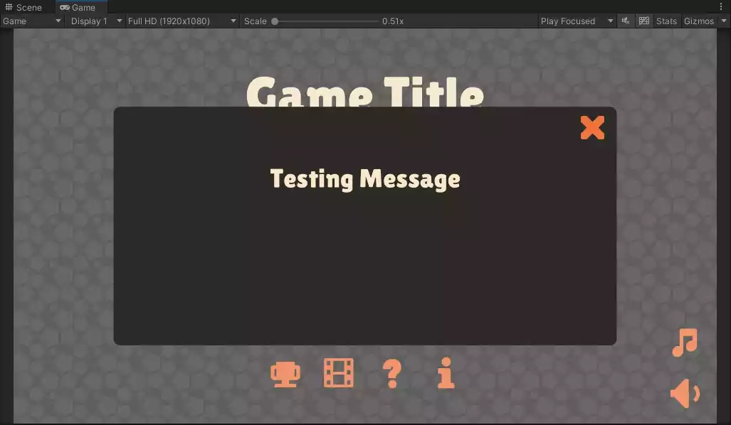
Calling the function UIManager.Instance.messageAppear(“Testing Message”) will open a Message popup for the user. You can use this to alert the player for anything.
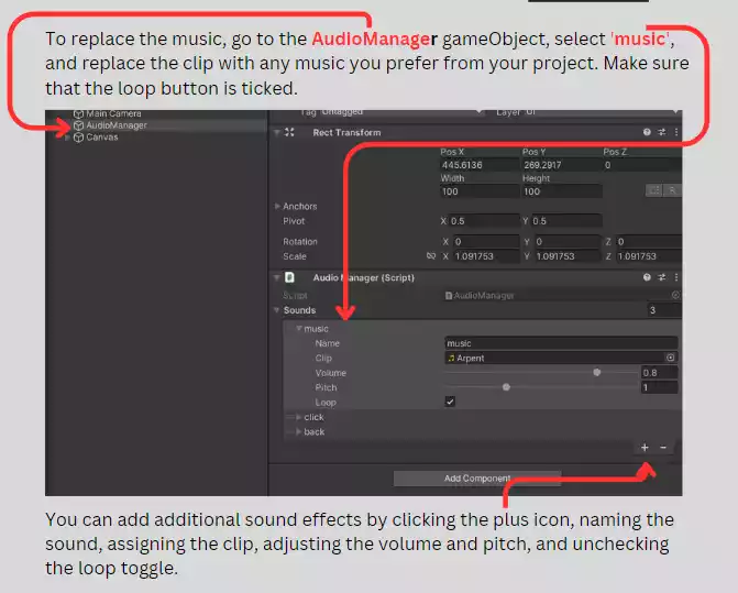
AudioManager
You can integrate universal audio for your game using the AudioManager. By default, I’ve included one music track and two sound effects for clicking and the back button. To understand how this AudioManager works, you can refer to Brackeys tutorial
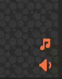
There are two toggle buttons to mute music and/or sound effects.
You can play the Sound FX called “click” by using this line of code:
FindObjectOfType<AudioManager>().Play(“click”);
If you have any questions or feedback, please feel free to contact us.